As Instagram’s global reach increases, the trends are coming thick and fast. A trend reflects what people are enthusiastic about, or what they are inclined to like or follow. While trends tend to be temporary—what’s popular now can easily be replaced by something else tomorrow—they also have a huge power to influence. And in some instances, great trends stick around to become the new norm.
Following a trend is more than about riding the wave of popularity and having good timing. Following a trend is a signal boost, making your brand relevant and visible. Done well, you can harness a trend to create real results for your business or brand.
These results will be more than just a boost in your followers or the likes on your account, but real business metrics: new leads, more sales, and a strong brand and reputation.
Here are ten Instagram trends that are making the rounds in 2018. Try one, two, or even all of them help bring your brand forward.
Brighten with bold colors to make a statement
The colors on a design can make a big impact. And right now, brighter and bolder color choices are dominating social media.
According to the Pantone Color Institute’s Pantone Fashion Color Trend Report Fall/Winter 2018, one industry where this is dominant is fashion. Autumnal hues such as deep red, russet orange, and olive green are paired with violet, yellow, and blue-green. These colors clash, but this particular palette works because the bright colors pop against the darker ones. While it has its roots in fashion, this partnership of colors can work on illustrations, layouts, and other design elements.
Need help with finding the right palette for your Instagram post? Canva Learn’s article about colors has all the information you need, from color meanings to palettes. Check it out here: Canva Colors.
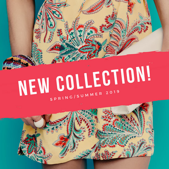
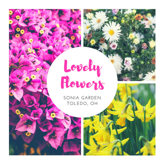
Canva offers hundreds of templates that explode with color. Start off with the Bright Red Banner and Floral Dress Instagram Post, or use a grid like the Pink Simple Flowers Collage Instagram Post.
Use the profile grid to create a wall of color
Instead of posting with the feed in mind, why not make the most of your profile page?
Recently, Instagram users have been taking advantage of the 3×3 grid on their profile by posting consective images that create a bigger image just like a puzzle. Other users take on a different direction by choosing a color, then posting images with different hues of that color. The result is a beautiful profile with colors changing every few images.
Fine art photographer Adam Rabinowitz of @colorcurated takes photos of everyday subjects during his travels, with a particular eye for color. He then curates these photos: when he posts them to fill the grid, it forms a solid-like block of color that is a feast for the eyes.

Fashion photographer Shaira Luna (@shairaluna) does something similar, using lights and filters to create the warm hue of her photographs.
Canva Mexico’s Instagram also plays on color, but cleverly changes the hue for each post that makes up the grid, to subtly transition into the next set of colors. When viewed as a whole, the profile is one big gradient.

Creating an attractive Instagram profile can entice people to visit your page and check out your posts as a whole, instead of waiting for them to appear on their feed. This is a great way to get past the algorithm that has people missing out on posts.
For inspiration, go through Canva’s templates by using the color as your search term. Here, the word ‘blue’ brings up several templates with various hues of the desired color.


